Financial markets data — and specifically investment data — comes in many guises. It can be structured or unstructured and contain multiple variables reflecting market conditions or the makeup of a product or portfolio.
Its traits are fluid and difficult to pinpoint, similar perhaps to those of a human’s personality, which has infinite combinations. It’s an interesting comparison that shines new light on data visualisation.
Everybody is unique and has his or her own blend of characteristics to define who they are and how they might behave. Various methods have been introduced to categorise, understand and predict these traits, from Myers Briggs to horoscopes, and they’ve all brought order to unstructured information.
These approaches identify and define key characteristics, then provide an understanding of their spectrum and further explain how they translate to behaviours.
>See also: Data is driving new skill requirements
Essentially, they develop labels for people and rationalise behaviours to predict what they might do or the effect they might have on others. The strength lies in the rationalisation and understanding of what otherwise might seem like an endless and complex list of subjective personality traits.
But what if firms applied this approach in the financial markets to make sense of objective data? Could they create personalities from structured data to draw quicker and more meaningful conclusions?
Imagine being able to view or “meet” a data set and immediately get a sense of its physical and behavioural attributes. The user could form an opinion of it quickly and over time understand longer-term trends and perhaps forecast tendencies.
Every data set has multiple features so the challenge is finding a way to convey them visually so the user can get a truer sense of them.
Is it possible to show data’s personality? And if so how?
Data visualisation today
Financial institutions have come a long way in trying to answer that question. As volumes grew, they wanted better ways to consume more information, make sense of it quicker and share it more easily.
Now it is commonplace for traders, research analysts, portfolio managers and investment professionals to have multiple monitors on their desks, giving them the ability to see everything instantaneously.
The problem is that these displays are dense with information and often fail to enable individuals to draw valuable conclusions.
Today, there are three main ways of showing multiple variables of data. First, and most common is via tables. This is perhaps the hardest method for the user to interpret yet the simplest to create. It requires the least amount of work to create since it is text-based in the form of a straight list of labels and values. Unfortunately, tables leave it up to the user to decipher and evaluate individual numerical values, making it time-consuming and hard to gather interesting insights.
>See also: More analytics – speed and agility through prediction
Second, is to combine tables with a few charts to highlight one or two data points. This approach alleviates the data table overload for users and replaces individual numeric value evaluations with simple charts. However, some consider this to be biased because it places more focus on the selected charted data over the table data, which has individual data points that require further analysis.
The third option is to use a mix of charts and graphs via a dashboard. Dashboards have become popular because they translate tables into visuals, removing the burden on the user to interpret the numbers. This technique works well when the data sets are discrete, unrelated, or show multiple views of the same data. Users can review these different data sets and quickly inspect the meaning behind the numbers.
But what if the data sets are related, multivariate and complex? In this case, dashboards still require the user to study tables or charts individually and then do more work to unite everything into a coherent representation. With this solution, the user’s efforts change from focusing on the individual numbers to focusing on connecting the various data stories across the individual charts.
There are many cases in which financial institutions need to reference and assess multiple variables to holistically understand and interpret the market. The movement in a stock price, performance of an industry or macro-economic influencers are just a few examples.
In these cases, it’s only when they can combine all variables related to a single entity into one view that they begin to understand the full picture.
Encoding visualisations
Statistician and MIT and Harvard professor Herman Chernoff understood the importance and power of holistically representing multivariate data.
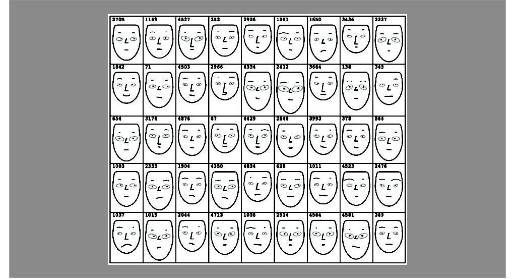
He realised that if he could combine these related data points into a single view he would be able to not just communicate many variables but also embody a better understanding of the data set. With his Chernoff Faces, he introduced the idea of encoding the individual characteristics of a face to represent variables.

Using the power of face recognition, he mapped the shape of the eyes, eyebrows, nose, mouth and head to different traits. This meant a user could read the data holistically as one whole set and individually as separate data points.
With speed and better approximation, users could read multivariate data through the image of facial characteristics. Chernoff showed the power of encoding a familiar object, like a face, which humans recognise easily.
>See also: The path to manageable data
If financial institutions were to adopt this approach, what objects should they select and how do they choose the right features to best illustrate their data?
A common data set is fund data, which contains information on asset allocation, market capitalisation, sector and region allocations and, of course, fund performance. A suitable object to mirror it should be something dynamic and that can change over time.
The object should also have a variety of characteristics that can match those in the fund data set.
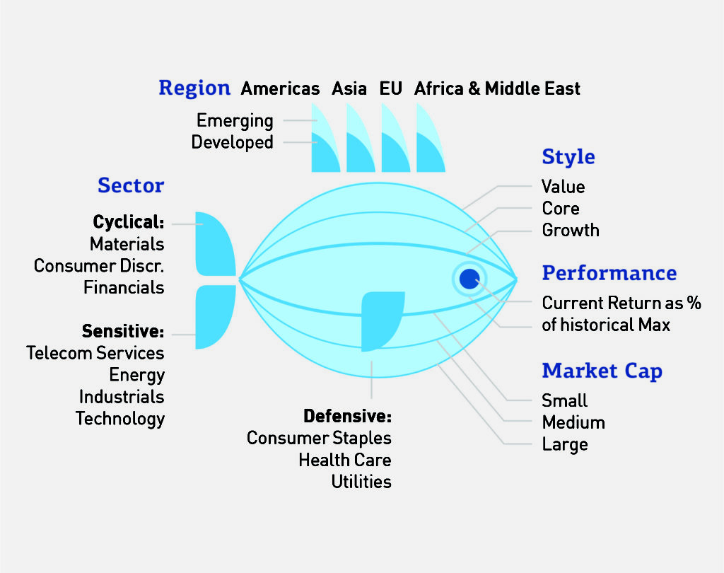
As a communication vessel, a fish can be as good as many other examples to visualise the data. It has several physical characteristics, such as a tail, a fin, eyes and so on, as well as different ways it behaves according to its surroundings.
Each characteristic could say something specific about each variable so that, collectively, the fish represents the whole data set in three distinct stages of analysis.

First is identification. The fish could embody the data’s major traits in a way that enables the user to see these first and get a sense of its personality.
For example, the overall width of the fish would show the fund style and market capitalisation. A large belly would represent large cap, a prominent back curvature would suggest value-based funds while a sleek-bodied fish would signal small cap, growth-based funds.
These primary characteristics stand out so the user can quickly assess its nature, such as whether the fund is large, slow-moving and steady or small, fast-moving and dynamic.

Second is evaluation. The fish needs to convey secondary traits; the ones that users want to understand upon closer inspection. These further explain the fund’s market exposure and results.
Examples include the top fin height and position to show region, the tail and lower fin to show sector and the eye size to represent performance.
>See also: Why corporate structure needs to change in the age of big data
Third is prediction. By illustrating these characteristics, the fish enables the user to build a picture of its personality, including its exposures and strategy— perhaps with an indication of past performance embedded in its eyes—as well how it behaves against market conditions.
The object makes all this clear to see without losing any detail. For example, the tendency of the large fish to move slowly and not be so readily swayed by market volatility is evident with both the identification and the evaluation steps. Armed with this insight, the user can predict its behaviour, leading to more valuable analytics.
Realising the value of objects
A single object to convey complex data has enormous potential to change how firms interact with information. First and foremost, they’ll increase visibility. By replacing individual tables and charts with a single representative object, users can see the entirety of their data sets with just one truly holistic view.
Firms can also make quicker at-a-glance assessments. The object would show major characteristics, such as fund size, clearly so the user sees these instantly and can make rapid initial evaluations — without having to trawl through numerical summaries and multiple charts.

Firms can also gain more confidence in their initial assessment of multiple data points across a collection of objects. The object—in this case the fish—has the potential to encode fourteen characteristics.
When shown as a collection of funds, the user can sort or group the collection to easily review individual characteristics within the relative context of other funds. The image above has organised the collection so that it is sorted by market cap and style.
>See also: 2017: the year of data literacy?
Therefore, the user can effortlessly review the collection of funds and select the fund to investigate in greater detail.
This approach also promotes greater collaboration. Tables, charts and dashboards come in various forms but often they are tailored to different groups of users. A visual object, however, is universal.
Users with all levels of technical knowledge would be able to understand it and use it to drive their conversations, paving the way for more collaborative work between business units.
Wider adoption in financial services
The above examples highlight how the approach lends itself well to representing fund characteristics — but this is just one way in which financial institutions could apply it across their businesses.
Additional use cases include other investment opportunities that have aggregate representations, such as ETFs, bonds and portfolios. It would also work with data sets that represent enterprise-level risk and compliance data, accounting data and transaction data to name just a few others.
Essentially it would work well for any case where users are tracking multiple variables, want to assess the situation of an entity as a whole, and would like to review all the data quickly.
The next step in the data evolution
Arguably, many firms do achieve a holistic view of data and make future predictions today. But mostly this still relies on individuals aggregating it from different views—whether tables, charts or dashboards.
It is still a time- and labor-intensive process. Few, if any, can do so through simple visuals that provide one single representation of everything—and in a way that users can easily digest and share across the enterprise.
Visual data representations have already come a long way. Graphs and charts have increasingly replaced spreadsheets as users demand more visual tools. Encoding data to a recognisable object is the next logical step. The technology to do so already exists.
>See also: Royal Mail’s data journey
The challenge will be in shifting cultures and attitudes to pave the way for its adoption, which could take more time or a market leader to champion the idea.
Finance is typically very numbers-driven. And although objects provide a visual solution, some might see them as too simplistic or perhaps not serious enough for the task at hand.
However, if that task is to make sense of chaos, perhaps it is by far the most apt and effective approach—and the one that will deliver the most rewards.
Sourced by Julie Rodriguez, information architect and Piotr Kaczmarek, information designer at Sapient Global Markets


